|
|
Congratulations! This is a free usability
review from UsabilityInstitute.com. "Usability" refers
to how easy and effective it is to use a Web site. Although
it involves how a site looks (graphic artwork), it is primarily
concerned with how a site works, what you click on, what happens,
and whether the site does its job.
The following three sections provide a general
analysis of your website from a relatively quick review. Although
Web design is still perceived as a highly creative endeavor,
there are many aspects of it that call for standardization
and compliance with widely established conventions. Implementing
even a few of the ideas below can really improve a site.
 |
|
|
This
first section is intended for typical public web sites
(for products and corporate information), but also applies
for the most part to intranets and software applications
that run in a browser. We've been advocating many of
these ideas—in the context of general software—since
our 1997 book,
Computers Stink, but they've been beautifully
enumerated for WWW purposes in Steve Krug's book, "Don't
Make Me Think." |
| |
|
|
 Click
for explanation Click
for explanation |
      |
 Hover
for explanation Hover
for explanation |
Comments |
| |
|
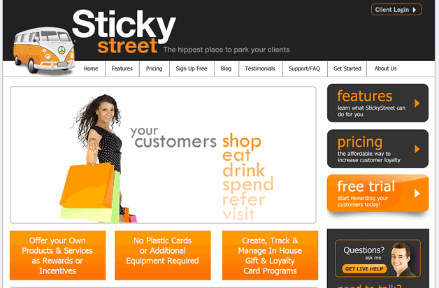
1. |
Logo
in top left, linked to home |
 |
It's there but not
linked. |
| |
|
2. |
Tagline |
|
Yes, "Hippest place..."
but would "Customer Loyalty. Simplified" be more to the
point? |
| |
|
3. |
Welcome
blurb |
|
No,
and I think this is an important one. This is a novel system
and it's not explained in one sentence high on the home
page. This is what I might be looking for: "quickly create,
manage and reward customer loyalty with points for visiting
and <???>" On my 1024 display this starts to show up in
the 3 orange boxes below the fold. |
| |
|
4. |
Plain
wording |
|
|
| |
|
5. |
No
'happy talk' |
|
The features page
is somewhat fluffy. |
| |
|
6. |
Concise
wording |
|
|
| |
|
7. |
Visited
pages are distinguished by link color-coding |
|
Not
really; interaction-wise, the whole site is like one big
graphic. |
| |
|
8. |
"Utilities" are
easy to find |
|
|
| |
|
9. |
Search
on all pages, with box and button |
|
|
| |
|
10. |
"You
Are Here" indicator |
|
No. For example,
when you're on the Testimonials page, the Testimonials
block
is not
highlighted in any way. This is slightly worsened because
the page names are creative...Sticky Street Fanatics. One
might say this is immaterial with such a small site, but
consider a busy exec who is on a mission to compare 10
loyalty vendors in one morning. |
| |
|
11. |
Breadcrumbs'
as links |
|
|
| |
|
|
|
If you've made it this far, I have a free
gift for the first 100 visitors who
reply. If you know anyone who's learning to read, email
me and I'll send you a free copy of a kid's book
I wrote. Please include "Poopy
Phonics" in the subject line so I have a
chance of recovering it if it goes to my spam folder. —Thanks,
Jack
|
|
—No spam, no emails,
no private info given out—
|
Do your hands ache after a day at the keyboard??? This review
sponsored by RSIRescue.com ... 
Summation & Next Steps
Overall Rating: Strives
/ Survives
/ Thrives
The usability faults are very trivial
checklist-style things; no one will fail to use the site because
of them. The main thing is use of space to communicate the
key message.
Recommendations:
- Decide on the key points (free trial, points program?)
and make them prominent. Make the banner and top nav smaller.
- Write a concise welcome blurb (sentence stating exactly
what the business provides, and to whom) and put it high
on the home page.
- Should you have fewer price points?
I continually look at freshbooks.com as
a reference and model for many of these judgment calls.
Hope this helps and let
me know what you think,
Jack Bellis, UsabilityInstitute.com
|